Art & Technology - 3D Printing - Design & Function

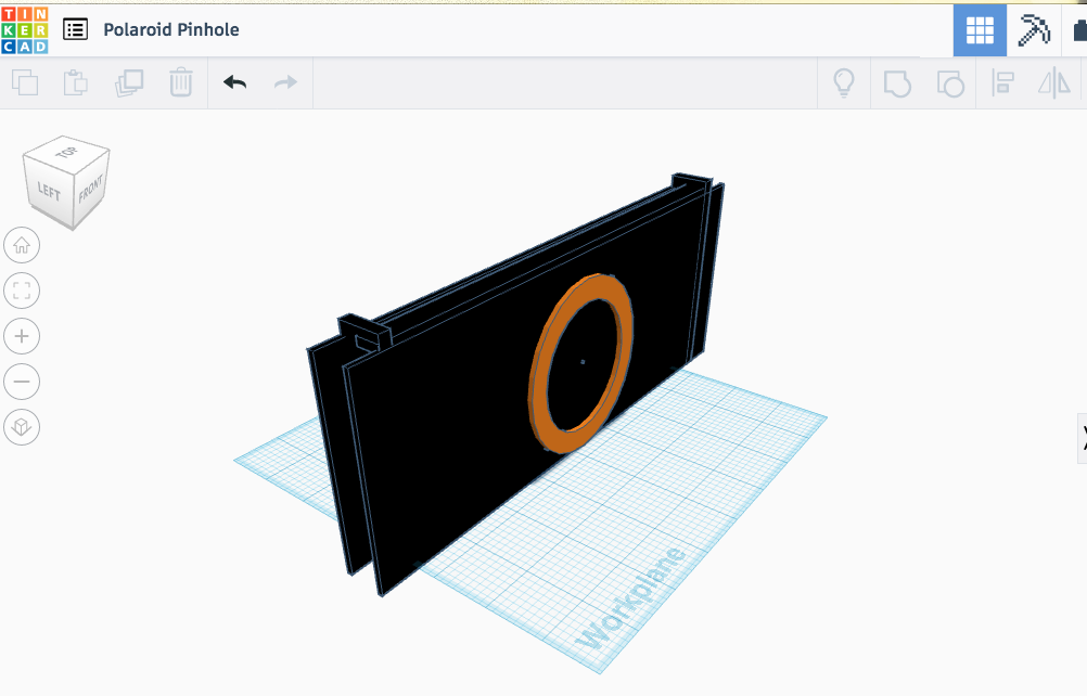
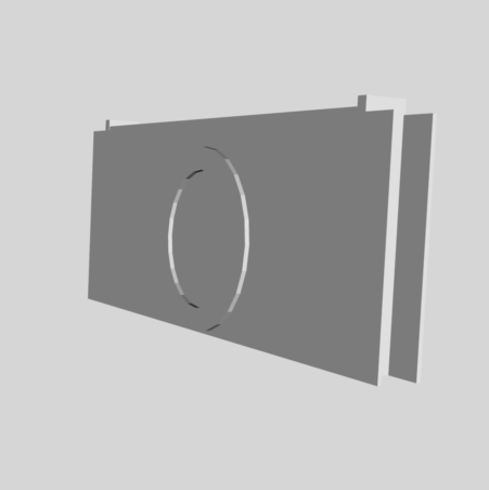
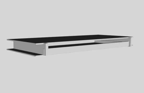
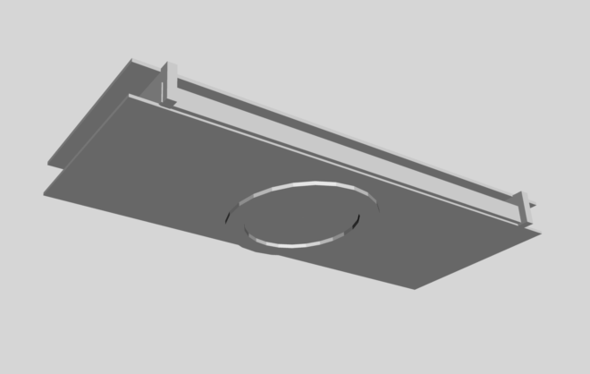
For my 3D modeling/printing project, I created a pinhole camera that is the correct size for holding a 3.5 x 4 instant film.  I made the design fairly simple, and was surprised at how much work it actually was to get all the measurements correct and line up all the parts.  I am not a 3 dimensional artist typically, so this is sort of out of my wheelhouse.  However, the program Tinkercad.com made it fairly simple and easy to figure out without too much...tinkering (pun intended).  I did run into a few snags, I wasn't sure why my 3D model was showing up so large on the workspace, but it seemed that any kinks or quirks were easily solved.  I didn't get a chance to actually print my design, so I would love to see if it actually works.  I left a slot open on the top to insert the piece of instant film, and I left a tiny pinhole (about .24 mm) open in the front at the center of the circular tube that is basically there for decoration.  Those would need to be covered with some black photographic tape to block out the light.  Pinhole cameras are pretty simple in their design, but take some finagling to figure out the correct measurements and time for a good exposure.  

As a teacher, I wanted to create something that would be relatively simple for students to create, but put their own twist on.  I also was interested in making an artistic tool that could be used to create more art in the future.  I really love the idea of functional art in general, and the function to create more art is even better.  Creating something from scratch using the technology we have today really redefines the way we are making art in the classroom.  I feel that these tools can really take art into a new level that marries the separated worlds of learning.  This type of project really has elements of STEAM - science, technology, engineering, art and math.  With pinhole cameras, that can also include elements of narrative and visual storytelling.  It is truly a new world we are living in and the art classroom, I feel, should be the basis of all aspects of education.

Art & Technology - Little Bits Project

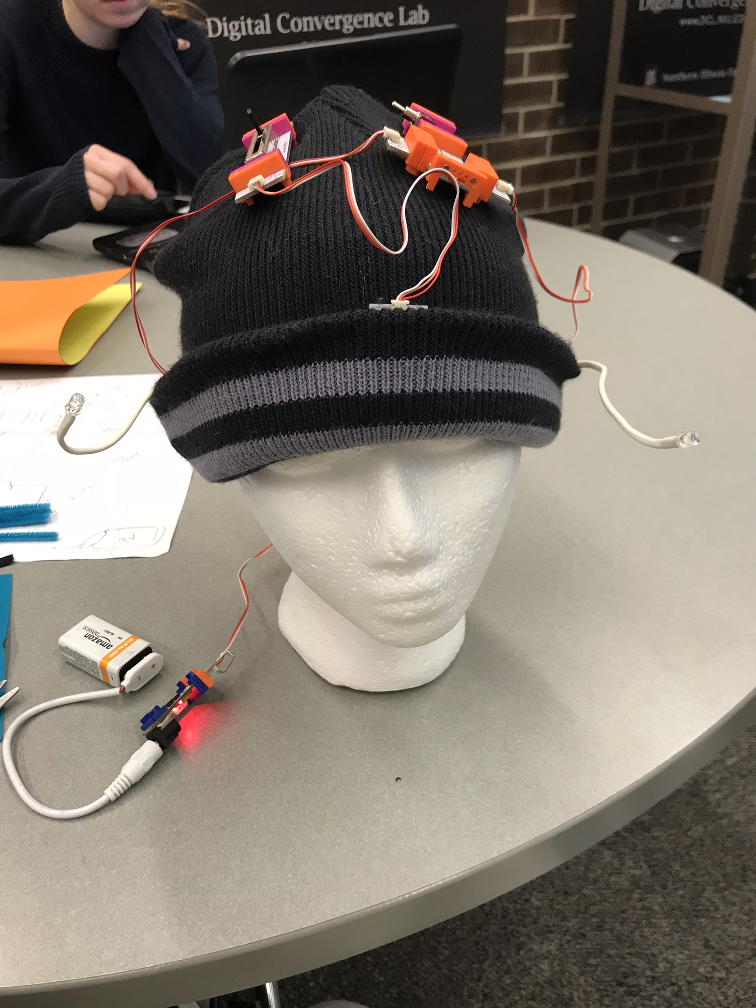
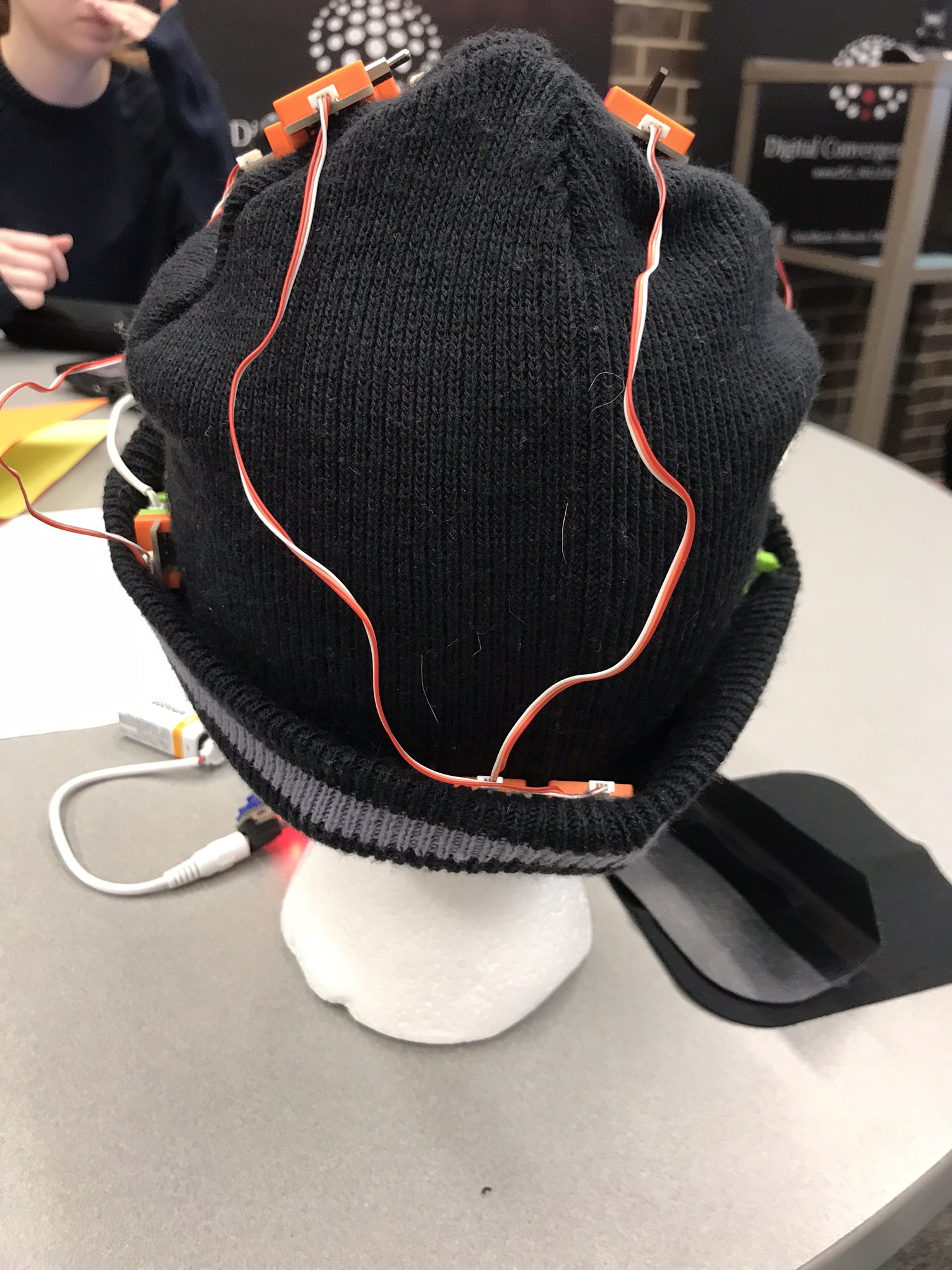
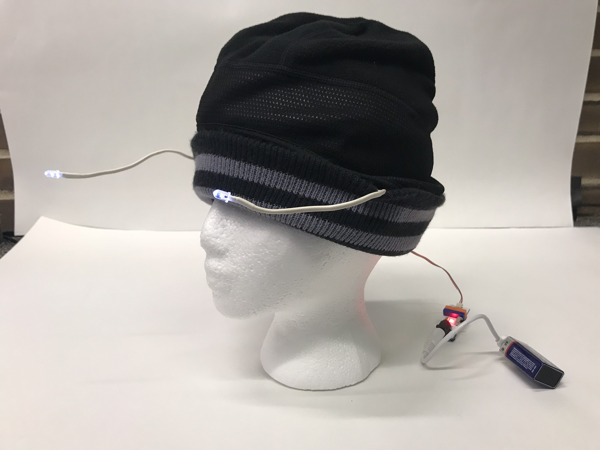
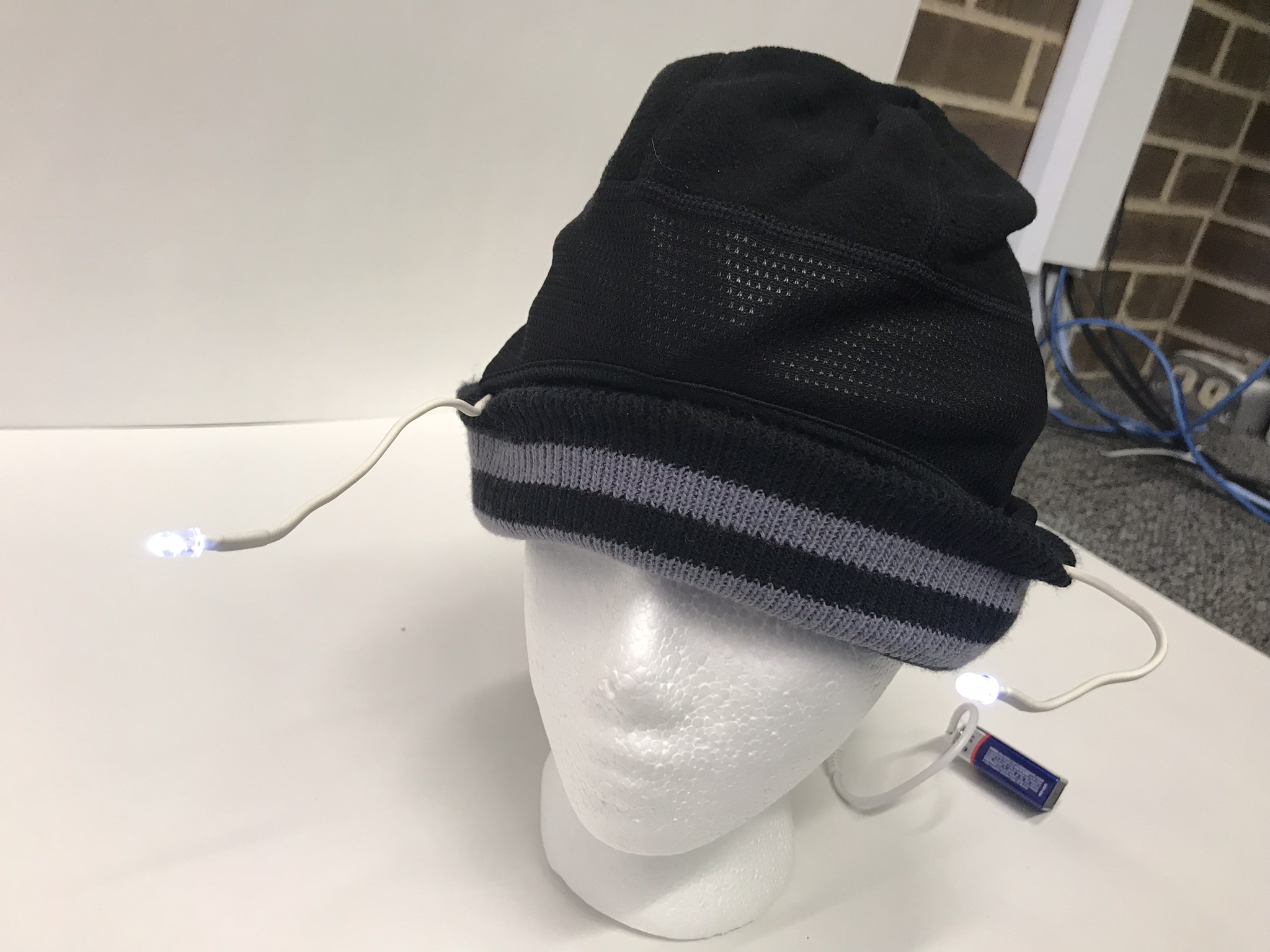
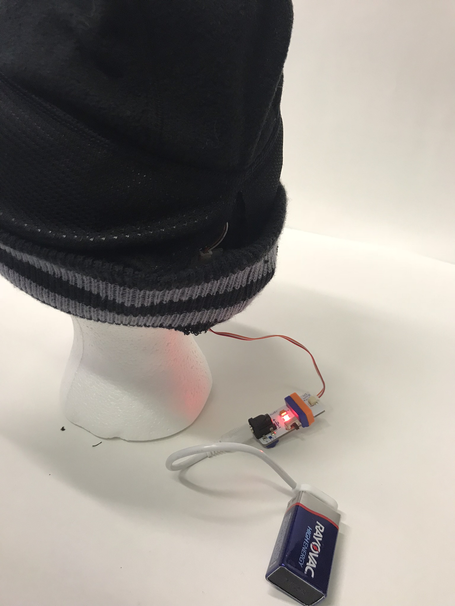
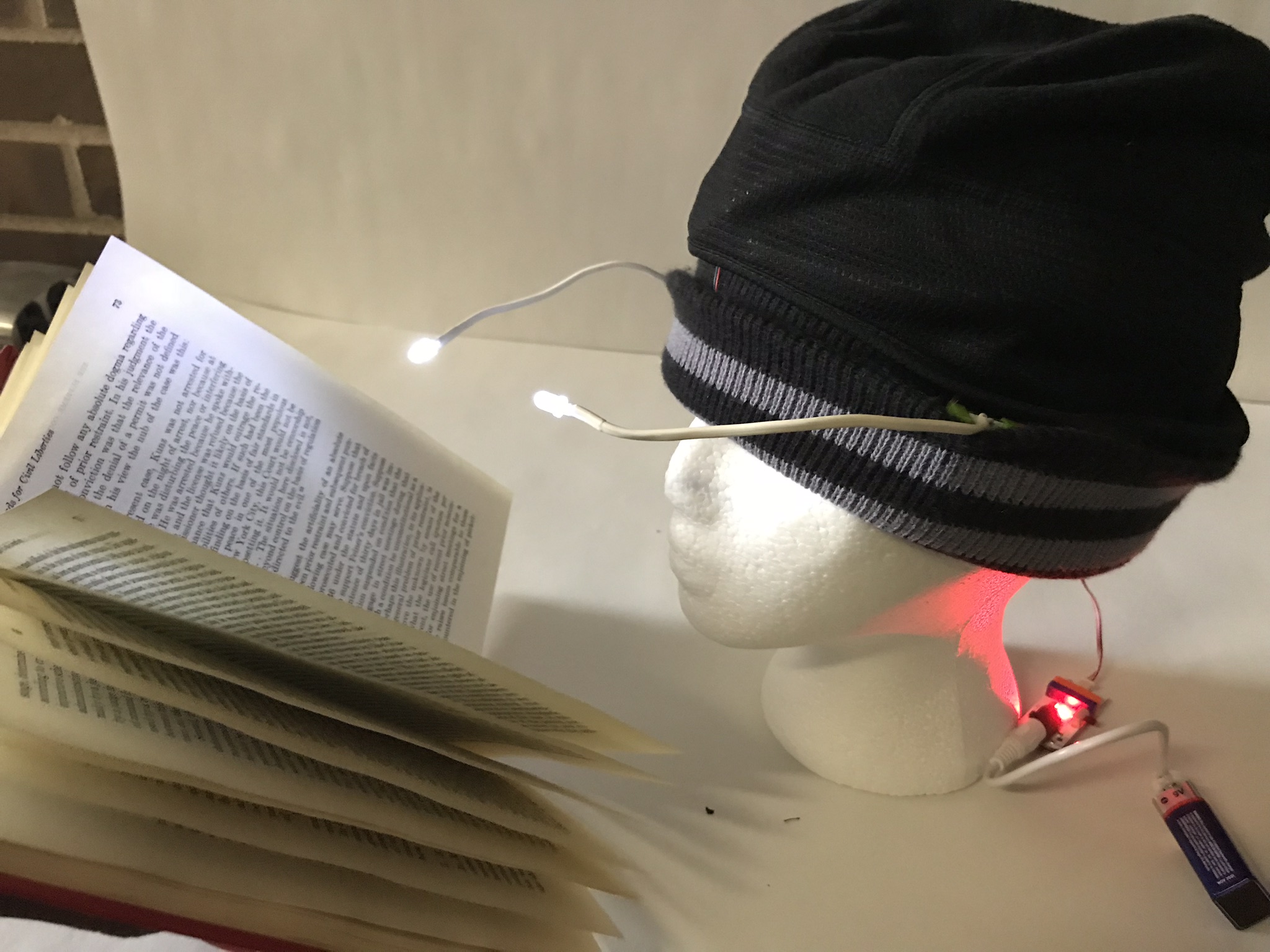
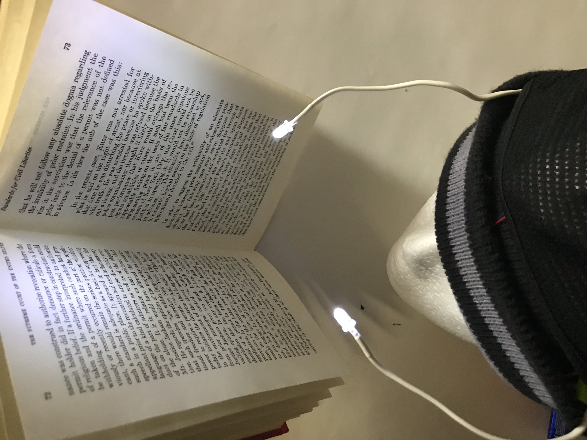
My project for our Little Bits unit was what I call the "Late Night Study Hat."  I used several Little Bits parts that were available through our school to create a hat you can wear at night to read using the lights on the side, and also gives you a forehead massage in case you get too stressed out. There are two switches at the top, one for the lights, which is an on/off switch, and one for the vibration, which is a slider switch to vary the level of power of the massage tool.  The whole thing is operated by a 9 volt battery.  In the images below, you can see my process of planning and assembly.  I did not hide the battery for the final project because I did not want to permanently fix the contraption into the hat since we had to return the Little Bits to the school.  However, if I was going to make it for future use, I would have tucked in the battery so it wasn't visible, and maybe added a zipper feature so you can change it as necessary.

Using Little Bits was one of my favorite projects in the class. I feel that it makes creation of functional art very accessible, as they are easy to use and hard to "get wrong", since they only click together magnetically.  I could see using these in any level of classroom, from elementary to high school and beyond.  I really enjoyed being able to create alongside my fellow students as well.  It was inspiring to see what others were creating and it was a great way to work collaboratively, which I think is important for students to learn how to do.  It also incorporates creativity, as I had to basically invent a new item that used the Little Bits we had on hand.  I could see having Little Bits in an art classroom in a maker space or as a project that augments or even modifies the curriculum.  I could also combine Little Bits with art making, changing projects from ones that are purely visual to ones that incorporate sound and motion and even function! 

My drawn plan for my Little Bits project

My drawn plan for my Little Bits project

Art & Technology - Erasure Art

For the Erasure Art project, we took images that were well known or had some famous meaning behind them and virtually "erased" some part of it so that it took on new meaning.  This was another postmodern project, as we were taking already existing imagery and recreating them to take on new form.  I used the program Adobe Photoshop, which I was already pretty familiar with and use on an almost daily basis for my job as a photographer.  Although this type of art comes naturally to me, it was interesting to use it in this way. I feel that it is important to teach students how digitally manipulating photographs can affect their meaning and emphasis.  Photoshop and those like it can be an effective and amazing tool but it also can be a dangerous one.  It is important for students to learn not just the positive aspects of the tools they can use, but also how they can be used for bad things as well.  This emphasizes critical thinking and value judgments that must be addressed at a young age or we risk perpetuating poor choices in art and in life into the future. 

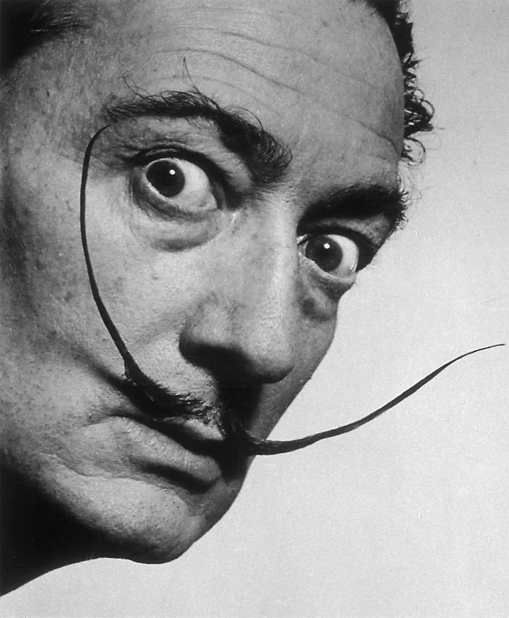
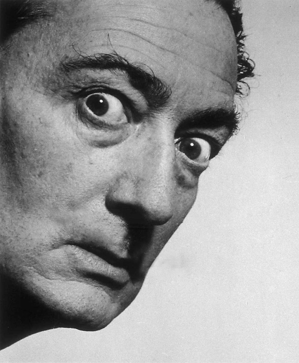
1. For my first image, I chose a pretty famous photograph of an even more famous artist -- Salvador Dali.  I feel like he is known for his quirky personality which is personified in his overly ambitious moustache.  In his second photo, I took the moustache out, rendering him practically unrecognizable.  When an artist is known for his facial hair, it seems like removing this part almost removes his personality, and I wonder if someone's looks are often more important than what they have done.  Perhaps not in this case, but it is an interesting thought to have.

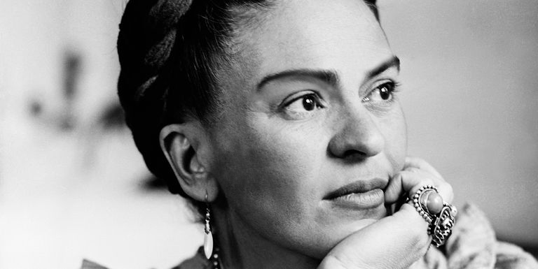
2. For my second image, I repeated the removal of facial hair in another famous artist - Frida Kahlo.  Although she was much more than her facial hair, she was known for not removing her overgrown eyebrows or lip hair in a sort of feminist statement against the patriarchal practice of women being expected to remove all extraneous body hair.  In the second image, I reversed it, thus robbing her of her most highly visible trait.  It is less about her personality (although that is part of it) and more about making a statement about how making her look like a typical woman removes some of the power she had as a very atypical one.

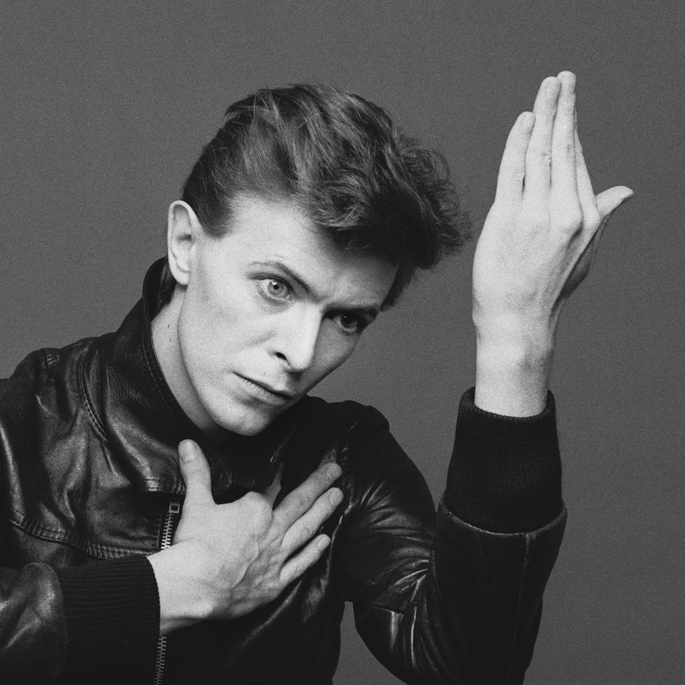
3. For my third image I used the cover of one of my favorite albums - Heroes by David Bowie.  The erasure of his mouth in the second image which I titled "No More Heroes," has a few different meanings.  Originally, I started to make it as a symbol of his silenced voice after he passed away. He has always been a hero of mine and after his death, his music and his presence have been "silenced" in my life.  So in that, I quite literally mean no longer will he sing "Heroes" and no longer do I have one of my heroes in my life.  2016, the year of his passing, was also the year that a lot of celebrities passed away, including Prince, George Michael and Carrie Fisher, just to name a few.  It is almost as if a piece of my childhood dies when one of the celebrities I have known and grown up with for so long leaves this earth, and that year was a big one for the death of heroes. It also marked the year in which Donald Trump was elected president.  Usually, the president of the United States, is often seen as a "hero" or a larger than life icon of dignity.  In this case, not so much.  Whatever your political leanings are, there is no denying that controversy has surrounded this presidency from the beginning and the respect usually garnered by someone in that position has been all but annihilated.  No more heroes.

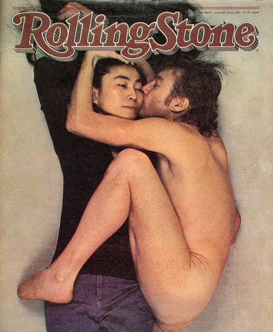
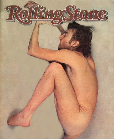
4. For my fourth image I chose another iconic music image.  The photo of a nude John Lennon kissing Yoko Ono, who is fully clothed.  The image was taken for the cover of Rolling Stone by Annie Leibowitz in 1980, on the day John Lennon died.  At the time, she wanted them both to be nude, but Yoko refused.  When she showed them the polaroid proof, John said she had captured their relationship perfectly.  The image has a lot of layered meaning, since it was one of the last photos of Lennon taken, and also has undertones of feminism, since it puts the powerful male figure in a vulnerable position of being naked, in the fetal position, and kissing the female on the cheek, who is clearly the more powerful one in the photo.  It also has a sad feeling, as if he is kissing his wife goodbye.  For my image, I took out Yoko Ono, leaving only a vulnerable and naked John Lennon kissing nothing. What is left behind is sort of a smashed, deformed figure, that loses all meaning and makes the image even sadder.  It makes him an anonymous body, someone that would not necessarily be on the cover of a magazine, and it strips the photo of its power, male or female, almost as Mark David Chapman did on that day.  He robbed the world of the power that was this couple. 

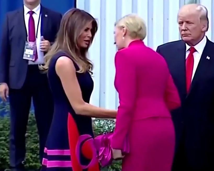
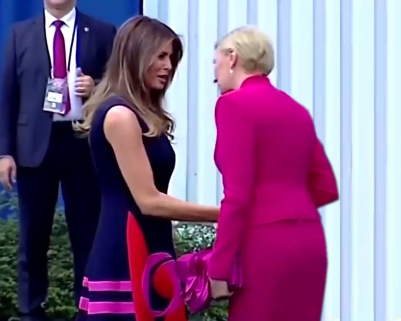
5. The last image I edited was a more modern photo, taken last year when Don and Melania met the Polish President and his wife.  This is a still from a video in which Trump extends his hand to shake the wife of the prime minister's hand, and she bypasses him to shake Melania's hand first.  Although it was looked at it as a humorous rebuff of the president, she did actually end up shaking his hand and probably did not notice his gesture in the first place.  However, his face as he gazes upon the women shaking hands as if they jumped in line ahead of him at the cotton candy booth at a street fair speaks volumes about the way our current president conducts himself.  I took it upon myself to take him out the picture entirely.  I entitled this one "If Women Ruled the World" and realize this picture would take on so much more meaning and power if he was never even in it. Instead of a glib meme, it would have been a historic meeting of two powerful females.  

Using programs like Photoshop to enhance artwork can considerably modify the way we create and view artwork. Just like glitch art, erasure art is a great way to get students to start thinking critically about the power of imagery and how we can influence others with it.  I would be interested in teaching students first to create their own story telling images and then use erasure to change their stories as well.  Although I think its important to critically examine historic and famous imagery, bringing it to a more personal level for students can really drive home how imagery can be used for good and for bad. 

Art & Technology - Glitch Art

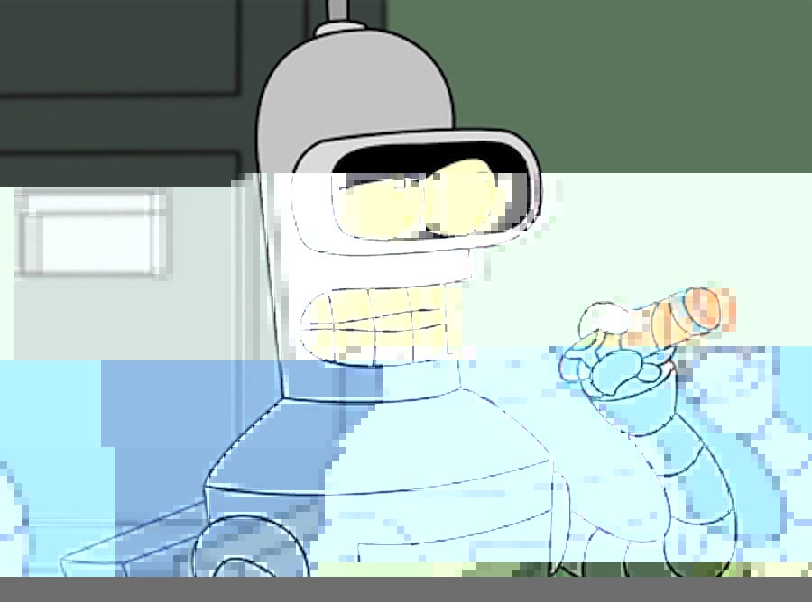
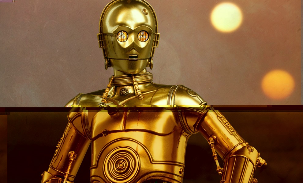
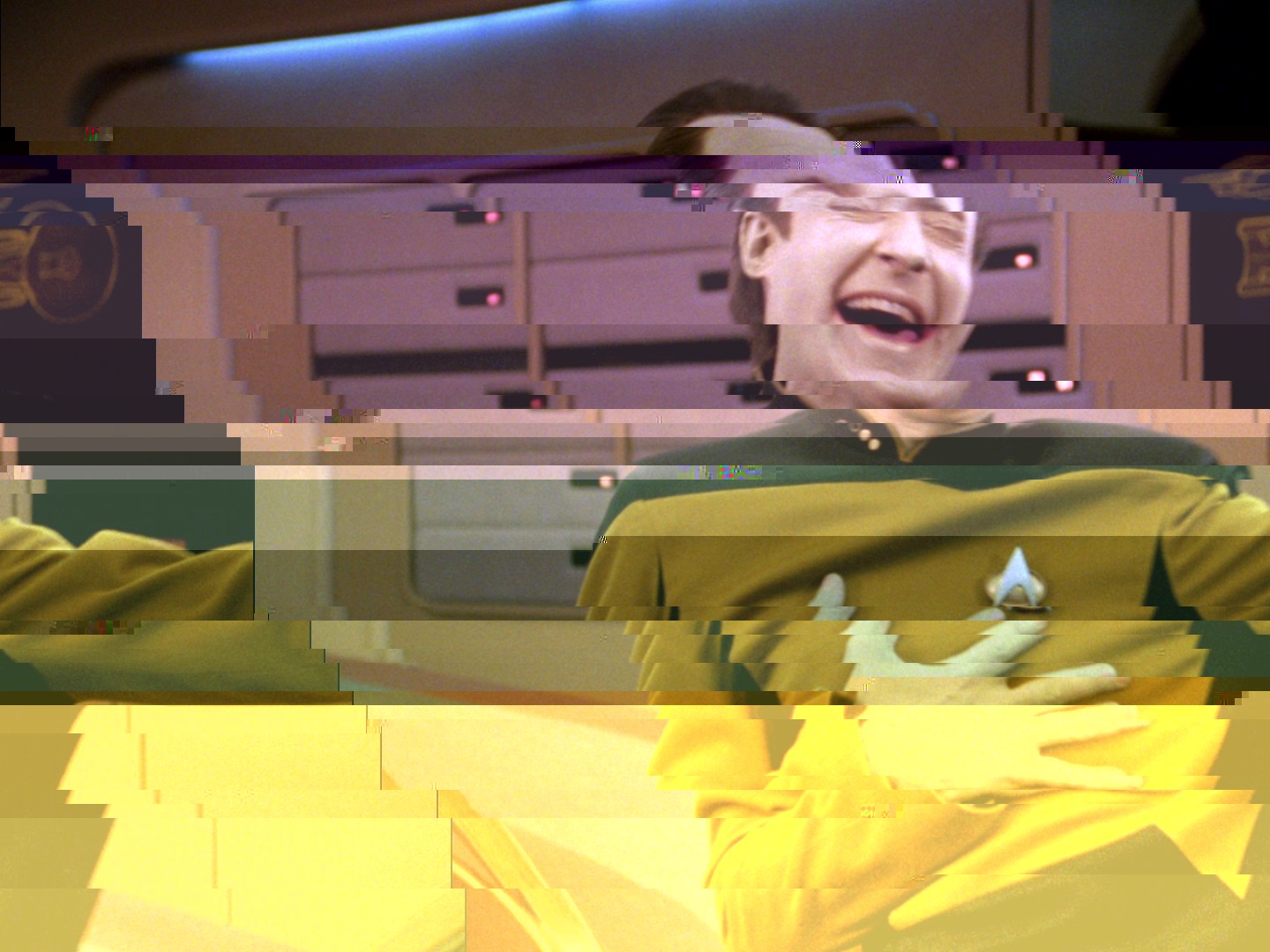
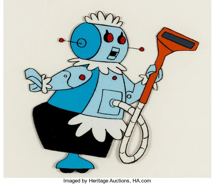
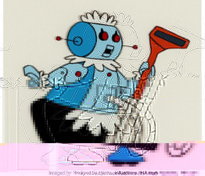
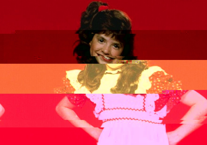
For our glitch art project, we took images found on the Internet and opened them in TextEdit (for a Mac) as .txt files, which translates the imagery into code.  Altering the code within creates "glitches" or mixed up colors and lines throughout the image when it is resaved as a .jpg file.  For my images, I chose my pictures of my favorite TV and movie robots, to echo the highly digital way this art is created.  In order to make the glitching meaningful, I took famous phrases or sayings that the characters would say, and periodically input them into the code.  In that way, the robots in a way glitched themselves.

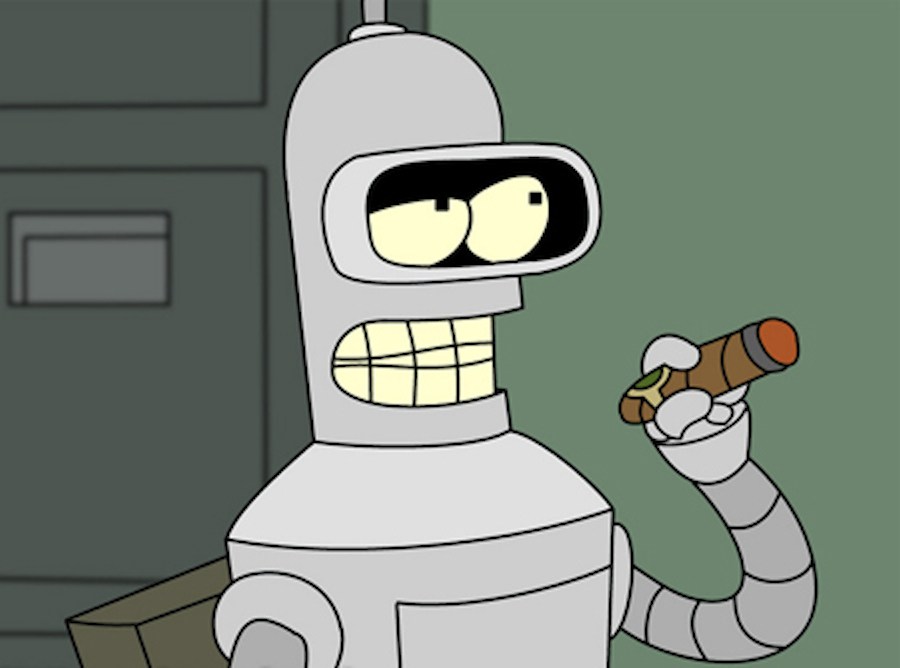
1. For the first one I chose the robot Bender from the TV show Futurama.  In it, robots live and work alongside humans and have cheeky personalities and relationships.  It is set in the year 3000, so aliens and robots alike live among us.  Bender has a love/hate relationship with humans, and often "dreams" at night muttering the phrase "Kill all humans", although during the day he is a chain smoking alcoholic that is lazy and has no morals, he does maintain a friendship with his coworkers and doesn't attempt to kill them for the most part!  I used his phrase "Kill all humans" throughout the image code to create the glitched one below.

2. For my second image I used a picture of C3PO from the Star Wars movies.  C3PO is a very logical robot that is something of a worry wort. He is always unsure of himself and others, so I used the classic robot phrase "that does not compute" to echo his negativity. 

3. For the third image I used one of my favorite "robots" of all time, who is actually an android.  Just like his fellow robots above, he lives and works among humans in the future, and is even more humanoid than most of his metal counterparts.  He rarely shows much emotion however, unless something had happened on the show to "glitch" him, and he turned even more human often to his detriment. In spite of his robotic interior, he was a very sentimental character, and also grappled with his less than human status.  His phrase I used was "I am more than my code", which describes the complexity of Data's character.

4. The fourth image is one of my favorite childhood robots and the rare female robot - Rosie from the Jetsons.  Although she took on the typical role of a robot as a servant for the family, she had a boisterous personality and was even caught on occasion crying over one thing or another. She even had relationships as well, calling into question whether she is more than "just a robot," and an interesting parallel between the suppression of certain races in our society, especially in the 1960's, when this show was first on.  Her phrase is "A Robots job is never done."  This took on some interesting glitch, which included almost an outline of her ghosted over the original image, suggesting that perhaps robots have souls after all...?

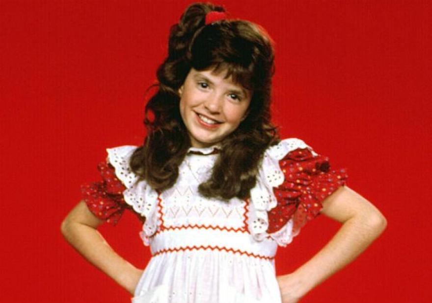
5. The last image is one of the robots I also watched as a child, but never really enjoyed except in an ironic way.  As in - so bad its good. It is Vicki, the robot from Small Wonder.  She was rather frustrating to watch, even though she was a little girl with super human strength and various robot powers, no one ever suspected her to be a robot, in spite of the fact that she never changed her outfit and spoke in a monotone robotic voice.  At that time I found it simply to be annoying, but now as an adult watching old reruns I actually started to realize that Vicki had a lot of similarities to some people I know on the Autism Spectrum.  I am certain the creators at the time did not intend her to be a metaphor for people with atypical neural qualities, but putting the show into the context of what is known today makes it much more poignant and meaningful.  The phrase I chose for Vicki is "Autism Speaks", which is actually the name of an organization that claims they advocate for those on the Autism spectrum, but is actually not run by nor employs any people who are Autistic.  It is a glitch in itself, and has made Vicki into a broken version of herself, when really there is nothing wrong with her at all.

I found glitch art to be very easy, and would be a great lesson to teach students at any age level, as long as it is used in a meaningful way, and not as a trick or a gimmick to make things look "cool."  It did feel fairly easy, perhaps too easy to create imagery like this, but I would find it interesting combined with maybe other type of art, such as painting or video/animation.  It definitely was an interesting way to create a postmodern type of art, substituting the computer for more traditional art media. 

Art & Technology - Thoughts on Glitch and Glitch Art

"What is the attraction to glitch? Or more so, why are glitch artists drawn to creating work in this genre? Is it the humanizing of what is sold to the public as perfection? The computer as perfection, a precision instrument, capable of executing complex mathematical sequences to such a high degree that we have come to accept the notion of virtual reality feasibly recreating real world experience? Does the glitch therefore become the humanizing element, exposing the machine for what it is, a man-made instrument, a tool only one layer removed from pure data represented as image? Is it the poetic element of distorting images to convey meaning?" (Donaldson, n.d.).

It is interesting to me that glitch has become its own aesthetic and something that is sought out and celebrated rather than corrected or fixed.  The definition of "glitch" is "suffer a sudden malfunction or irregularity." Meaning that, originally, glitches were something that were unwanted.  Nowadays, when a piece of technology or program glitches, we use it as a form of entertainment or art, and as the quote above mentions, a way to "humanize" our machine world.  As mentioned in a previous post, our lives are increasingly dependent on technology.  Although we don't want our devices to malfunction, it does bring them down to our level, and it is up to us whether we consider glitches to be unforgivable or not.  As the saying goes "To err is human, to forgive is divine."  We are in a time where we forgive our glitches and actually turn them into something good.

In the video above, the narrator shows us several glitches in the original Super Mario Bros. game.  At the time the game was made, I'm unsure if these were left in on purpose or not.  These days, it seems that some glitches are left into video games as sort of Easter Eggs to find as you play.  It adds another level of entertainment to the game above normal play, and an air of mystery that is fun to hunt down and figure out.  Other kinds of glitches, such as the ones that are purposely made in glitch art, are another form of showing that even though our lives are run by technology, we can still show machines that we are in charge. 

In a classroom environment, glitch art is a great way to teach about critical thinking about the way we can use technology.  Although a lot of processes that went before are automatic with certain programs or devices, we can more or less throw a wrench in the works and see what positive outcomes result.  This also puts a spin on creativity - instead of finding out how we can create something, we have to figure out how we can break something in a creative way.  This completely redefines how art is typically made and taught. 

Reference

Donaldson, J. (n.d.). Glossing Over Thoughts on Glitch: A Poetry of Error. Retrieved from https://webcourses.niu.edu/bbcswebdav/pid-5043831-dt-content-rid-37831821_2/courses/20182-ARTE-343-----1/Donaldson%2C%20J.%20%28n.d.%29.pdf


Art & Technology - Game Controller

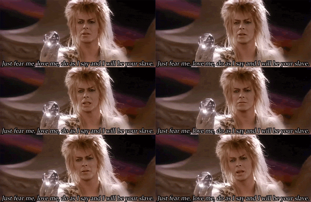
I really enjoyed the game controller project we did.  It came easier for me to create more than the game, perhaps because of our previous experience with Makey Makey.  I did like how the game controller and game brought our Scratch, sound, programming, animated gif and Makey Makey projects all together to work cohesively as one thing.  For my controller, I chose to create a spherical ball reminiscent of the crystal ball that the Goblin King uses throughout the Labyrinth movie, and the one that Sarah is trapped in during the ballroom scene.  I used an old clear plastic ornament, and attached metal clips to it as the "buttons." Inside, I used a phone wire with 4 small wires inside to attach to the Makey Makey for my four controls in the game - up, right, left and the space bar.  I wanted to be able to use the controller in one hand (my second hand use in the video is only to steady it).  I painted it white to conceal the wires inside as well. 

The game creation itself came together in the end, even though it was more simple than I originally intended, and it was interesting to play it with the controller because it added an element of difficulty.  I made the controller to fit my hand too, so it also has an element of customization and uniqueness to it that I wasn't expecting for some reason.  It definitely adds to the artistic quality of the game, to have a one of a kind controller. 

IMG_1309.jpg
IMG_1308.jpg

As art teacher, I look forward to incorporating multiple artistic techniques into single projects.  I feel like this adds an element of dynamic learning that helps students realize their strengths and overcome their challenges. Working on large scale projects like this collaboratively would also be a great way to teach about teamwork and getting along with peers.  Although I think technology can be combined with traditional art making practices, projects like these completely redefine the way we can teach in an art classroom.  It truly combines many disciplines, and is aligned with STEAM curriculum.  I look forward to using new media in my classroom in the future.  

Art & Technology - GIF Animation using Piskelapp.com

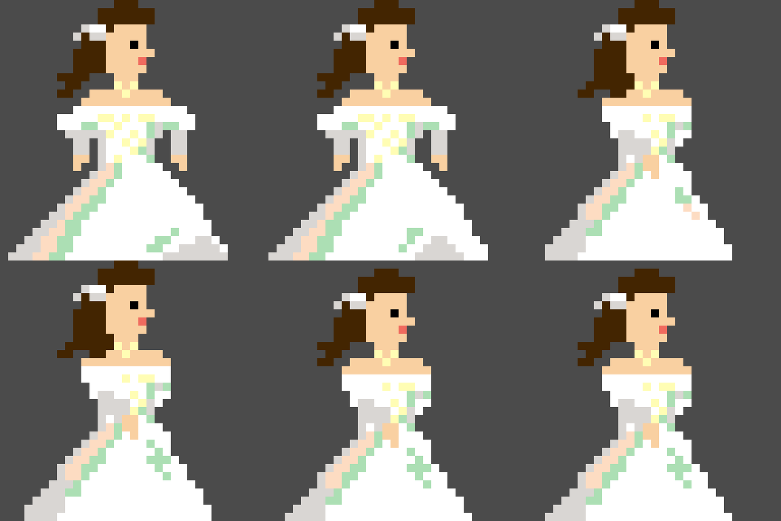
For one of our projects in our art and technology course, we created animated GIF using using Piskelapp.com.  I found the process to be fairly easy to create and edit, having no previous experience creating pixel art nor animations.  I based my image on the character of "Sarah" from my favorite movie Labyrinth.  She is "walking" in her ballgown she wears in one of the scenes.  Her hair sways back and forth as she steps, and the "sequins" on her dress change with her movements as if shining in the light.  I found this very similar to stop motion animation, but with a digital twist.  I feel that my future students would really enjoy this simple to use program, and it would teach them the basics of animation with a vintage flair, since it is reminiscent of the pixel animations used in old video games such as Super Mario Bros.  It modifies the traditional animation practices of pencil and paper or claymation by adding in the computer element.

Sarah Walking (1).gif
SarahSpriteSheetForBlog.jpg

Art & Technology - Stop Motion and Autoethnography

"Arts based reasearch & autoethnography share many of the same aims, including blurring boundaries between the social sciences and the humanities, utilizing forms of creative expressions and the inclusion of the researcher as the subject" (Blair, 2014).

When I was in my first semester of grad school, we had to create an autoethnography of our lives so far, which incorporated not just "navel gazing" as my professor put it, but also a look at the world around us and how it has shaped who we are and the decisions we make.  The entire experience was reflexive - it changed the way I feel about the way I view myself and the people around me.  Below is the autoethnography I made for myself using Adobe Spark:


Autoethnographic research doesn't just give you a better understanding of people, it can also inform the way you create and look at art.  As an art educator, using autoethnography, especially at the high school level, can connect students to their work and make them more confident in the choices they make and as artists in general.  Incorporating technology and art with the creation of autoethnography can greatly redefine the way a traditional autobiography might be made, with the written word on paper.  It involves not just the critical examination of a life and its privilege and disadvantage, but also takes the story of a life and puts it into a visual, highly engaging form. Below is an animated autoethnography I found on You Tube.  Animation gives the autoethnographic project an added element of art and also allows the creator to get a little more personal by removing the direct biographical element as in video, imagery and voice:

Reference:

Jeremy Michael Blair (2014) Animated Autoethnographies: Stop Motion Animation as a Tool for Self-Inquiry and Personal Evaluation, Art Education, 67:2, 6-13

Art & Technology - Video Game Song "As the World Falls Down" by David Bowie

For this project, I made a soundtrack to my soon-to-be created video game "As the World Falls Down," which is inspired by the scene in the movie Labyrinth when the main character, Sarah, gets caught inside a crystal bubble ballroom world created by her nemesis, the Goblin King, as a way to stop her from completing her mission through the Labyrinth.  The music is based on the song by David Bowie, which was composed for the movie.  I used the sheet music from the song, along with sound bites created on Pulseboy.com.  I then looped the sounds and composed the song using Soundtrap.com.  On Soundtrap, I was able to slow down, speed up and piece together each separate part, to create a 2 minute and 26 second musical number. 

Using these technologies to create a soundtrack was easy and fun to do.  Programs like Pulseboy and Soundtrap are a great way to augment sound making and recording. I am not a musician, but I was able to use my limited musical knowledge to translate and modify the song into a semi-original piece.  I think that this type of composing would be beneficial in a classroom setting, especially among those who have never written a song before.  It was kind of like taking building blocks and placing them one at a time to form one larger thing, which was way less intimidating than actually setting out to write a full song all at once.  Being able to copy a tune also allowed me to learn more about music writing and composition, which I could use in the future to create a more original song.  Although I don't think copying is always the best thing to do, I feel that sometimes it can help teach how things are created by breaking it up into parts and reassembling it. 

Art & Technology - Thoughts on 8 Bit Video Game Audio, Then and Now

I grew up in the 80's and played video games (or watched my older brother play them) as far back as I can remember. Although I don't always remember every nuance of graphics or gameplay, the songs that accompanied the games I played are always recognizable and ingrained on my memory.  Back in the 80's, the limits of technology (or at the time, they were seen as advances), added a certain aesthetic to the music of video games that puts it unmistakably in the decade of decadence, where everything felt like it was from the future or "in the now."  That aesthetic translated into very memorable music, and those tunes are ones I hum even to this day.  Super Mario Brothers, Mike Tyson's Punch Out, Paperboy, among others, were all part of my daily routine.  The music was simple, yet usually held a driving beat that kept me motivated to play the games over and over and over, speeding up when the time was running out, getting more mysterious as I entered an underground level, or illustrating that my foe was from a different country than the one before. 

All of the songs were used to augment my experience with playing the games, make them stick in my memory and motivate me to play them multiple times.   The one similar aspect of all of the soundtracks was the use of looping to create short bursts of sounds into longer melodies.  Not only did this mimic how popular music was made at the time, it also created auditory cues for how I experienced  the gameplay.  For example, the short victory tune at the end of a Mario level, when he jumps on the flag and enters the castle.  This always gave me an almost Pavlovian response of relief and joy, as if I had been holding my breath while playing and could now relax. Or when the timer came to less than 100 seconds, the music speeds up to warn the player that they need to go faster.  Gameplay doesn't speed up, but the automatic response is to run and jump over obstacles and enemies much faster.

"It would appear, then, that rather than being the consequence of the limited memory available on the systems, loops were, at least in part, an aesthetic that grew as the games became more popular and more complex." (Collins, 2007)

Nowadays, students are still playing the "retro" games of the 80's and experiencing it as a sort of nostalgic aesthetic, rather than a futuristic or current one.  Even though music soundtracks on games have greatly surpassed the level they once were, there is still a fondness for the way things used to be.  In that, we can teach students that often when technology becomes "obsolete", it can be used in a new way or how we can use it to modify or redefine what we already do, rather than lost and forgotten.  Appreciation of older technology can create that greater respect for the way things are now.

Reference

Collins, K. (2007). In the Loop: Creativity and Constraint in 8-bit Video Game Audio. Cambridge University Press.


Art & Technology - Sound Effects

For my second project, we were asked to create 8 sound effects, using a combination of samples, which I recorded on my iPhone 7, and also sounds created on the website bfxr.net.  For all of my projects as I learn to become an art educator, I like to get my children involved as much as possible. They are 7 and 4, so their tastes and sense of humor are of the potty variety.  Although these particular sounds and subsequent "instrument" I created (see it here) are not necessarily school appropriate, I did find the creation of sound effects to be highly educational.  We were faced with the challenge of trying to recreate a particular sound without actually using the sound itself (in one case we did).  We had to implement some creativity in order to get a variety of different noises, which had that distinguishable quality of the fart noise.  

In a classroom, I would love to create a project that involved creating sounds that are either original noises or mimic existing sounds without actually using the sound itself.  This presents both a challenge to creativity and an attention to nuance and detail.  It also teaches students that we can use our sense of hearing to evoke feeling or emotion, such as humor. 

Using bfxr.net was very simple and straightforward.  It provided a variety of controls to change the qualities of the sounds, and was easy enough for me to figure out immediately, without having any prior sound creation experience.  I think this would be a valuable tool to use in the classroom when creating sound effects, and would augment or even modify the way sounds are captured as samples.  It gives a nice introduction to the history of video game sound in particular, while teaching about the variety of ways sound can be made and recorded.  Samples are also a great way to augment sound making.  As demonstrated with my "Fart Sounds" below, you can use a variety of items and materials to create sounds that don't necessarily represent what they actually are.  This project was a lot of fun for me, and for my kids as well!

Art & Technology - Thoughts on Evaluating mLearning and New Media

At the heart of mLearning and New Media is combining the classroom with the devices and imagery that deliver to us our visual culture.  There is no denying that technology and social media are a big part of our daily lives.  It seems that art education presented online or combined with the mobility of certain devices like phones and tablets, can create a lot of positive outcomes, including a dynamic learning process and increased peer interaction and inspiration.  The ability to linger on a certain work or works and reference the archive of commentary on it helps further a student's knowledge and creativity.  Art has increased its definition beyond the traditional realms of drawing, painting and sculpture.  It now includes new media like video games, digital art, movies, and more.  The blurring of the lines of what makes up art has made it accessible to everyone, not just the "artist."  

Cell Phone Use Hazards, Specially for Teens.jpg

Although mobile learning and New Media have their positive sides, I feel at times the ease and accessibility of the Internet can be a trap.  Not taking part in face-to-face connections could possibly lead to more timidness, laziness and less accountability in less self-motivated individuals.  Purely online courses can also provide a sort of anonymity in participants, which may at first, feel like a comfortable layer of protection, but the tone of written comments can be misinterpreted and lead to misunderstandings and self doubt. I feel that in person interactions not only build confidence in who your peers are, but also in your own self, which is often not present in adolescents.  I also feel, especially with non-photographic art such a painting and drawing, viewing a piece in real life can lend itself to a more emotion reaction and connection with the art.  Viewing artwork on the screen is sort of a "watered down" version of the real thing, often obscuring size, texture, color and contrast. Perhaps a solution for the future is to have a combination of online coursework and in person interaction and viewing of artwork. That way, art educators can reap the benefits of both types of learning.

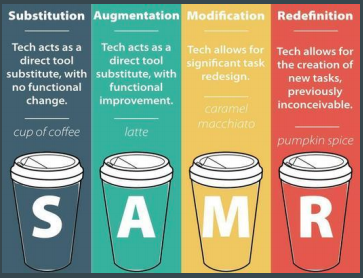
The SAMR model is a way to define how mLearning activities are changing the way we conduct our curriculum in an art classroom.  The SAMR Model uses four classifications of technology:

• Substitution: The technology provides a substitute for other learning activities without functional change.

• Augmentation: The technology provides a substitute for other learning activities but with functional improvements.

• Modification: The technology allows the learning activity to be redesigned.

• Redefinition: The technology allows for the creation of tasks that could not have been done without the use of the technology. 

Using the SAMR model helps give a solid reasoning behind the activities used in the art classroom, so that they are more meaningful to learning and not just utilizing technology for just the sake of using technology. 

Screen Shot 2018-05-08 at 11.54.08 AM.png